 Managers love pie charts. Unfortunately, my initiation to the Dark Side did not include the Handbook of the Art of Pie Charts. When I see a pie chart in a presentation I usually wonder “What’s up with this pie chart?” or “What is this really trying to tell me?”
It usually flashes up on the screen, a welcome break of colour and shape in the endless bullet points of a Powerpoint presentation. The presenter waves a hand, stating the obvious that one piece of the pie is bigger than the other, proving whatever point they were trying to make. Did I mention it was a welcome break of colour and shape?
Maybe it’s because I’m a former Quality Engineer and I know how to slice and dice data however I want. Or maybe I simply want more information. Where am I going? What are the trends? The here and now is fine, but what does this mean? How does this help me make a decision? Other than saving me from a death of bullet points, why is this important?
Don’t just show me pretty charts. Give me some analysis. Don’t just give me pie. Show me the meat and potatoes and give me food for thought… and decision-making.


November 18, 2013 at 4:36 am
Hello Liza,
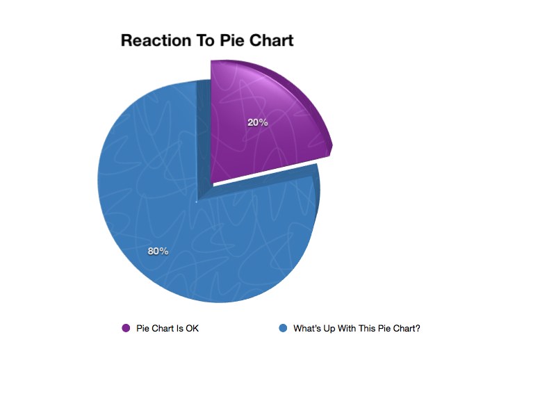
I like pie charts to visualize a concept which is not necessarily obvious. If a pie chart is suprising, it is a powerfull tool. Otherweise they are rather boring. Except from 80:20 charts, because they look like pac man 😉
November 18, 2013 at 7:30 am
LOL! Yes, the 80/20 pie charts do look like Pac-Man 🙂 Pie charts do have a use, like you described. Sadly, I’ve seen too many presentations that use pie charts for everything, even when a simple table will do.